Our earliest logo was in use from the company beginning in 1946 up through the 1970s. Script initial caps combined with hand-lettered lower case characters in a bold Futura. In the center was the logomark—a zebra and lance. The zebra as a motif was popularized by a print designed by Flora Scalamandré in the 1940s for Gino of Capri restaurant in New York City.
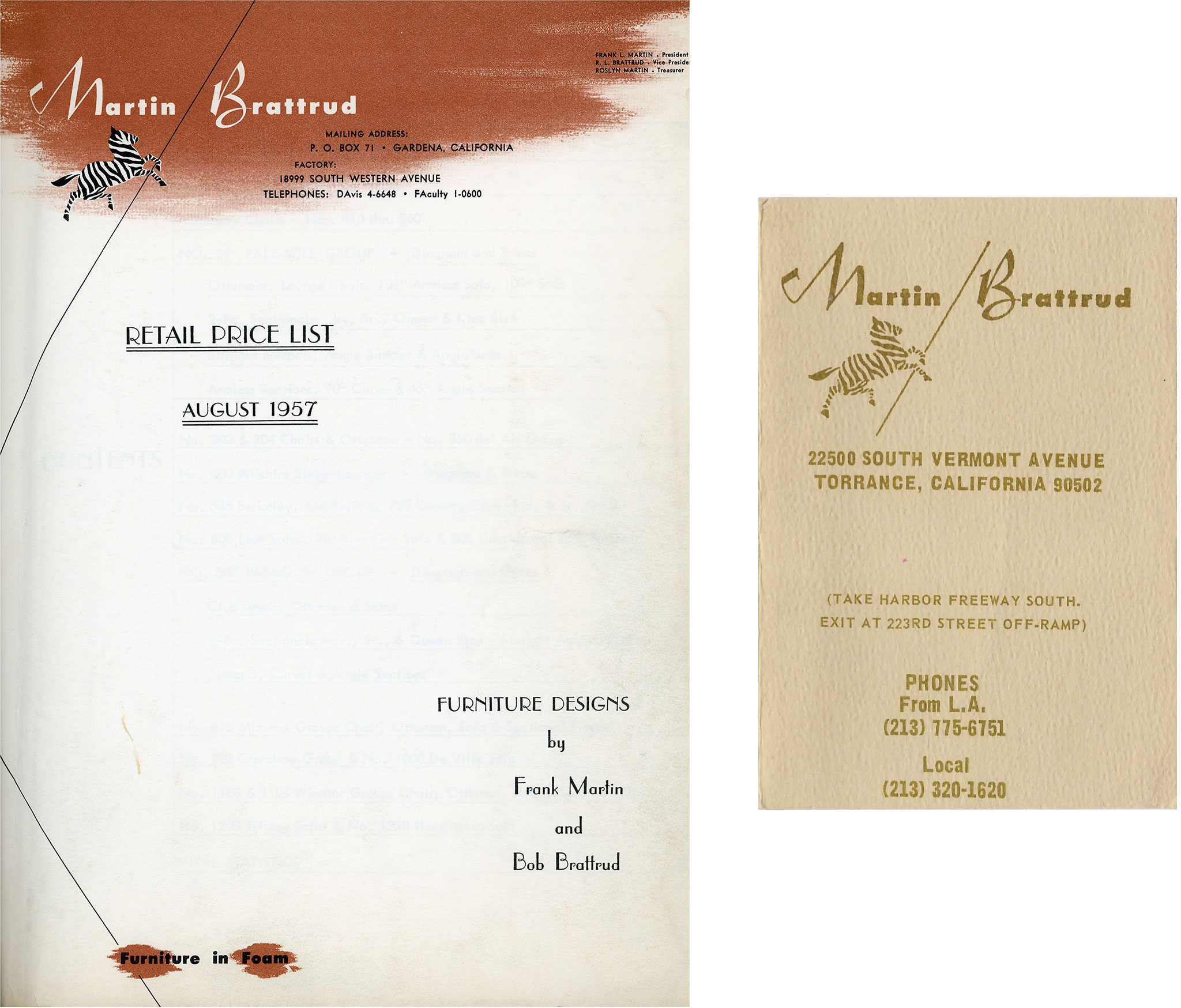
A strong diagonal line was a common element throughout our earliest materials, derived from a slash "/" and signifying the original partnership of Frank Martin and Bob Brattrud.
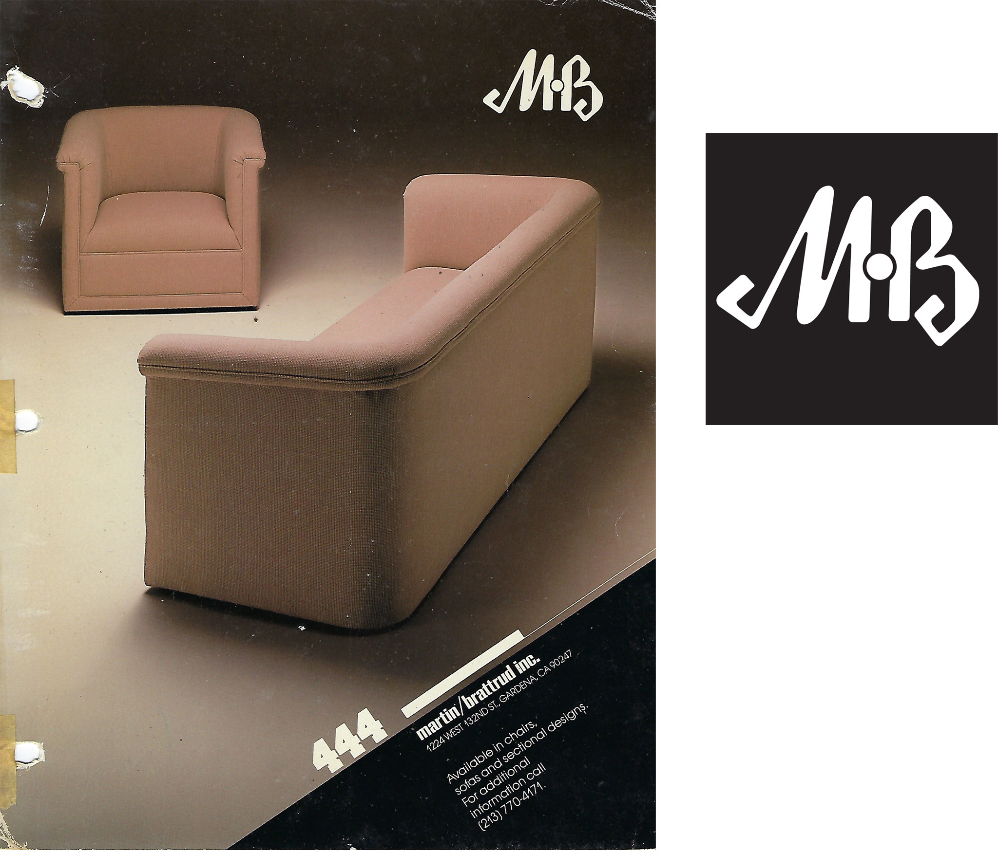
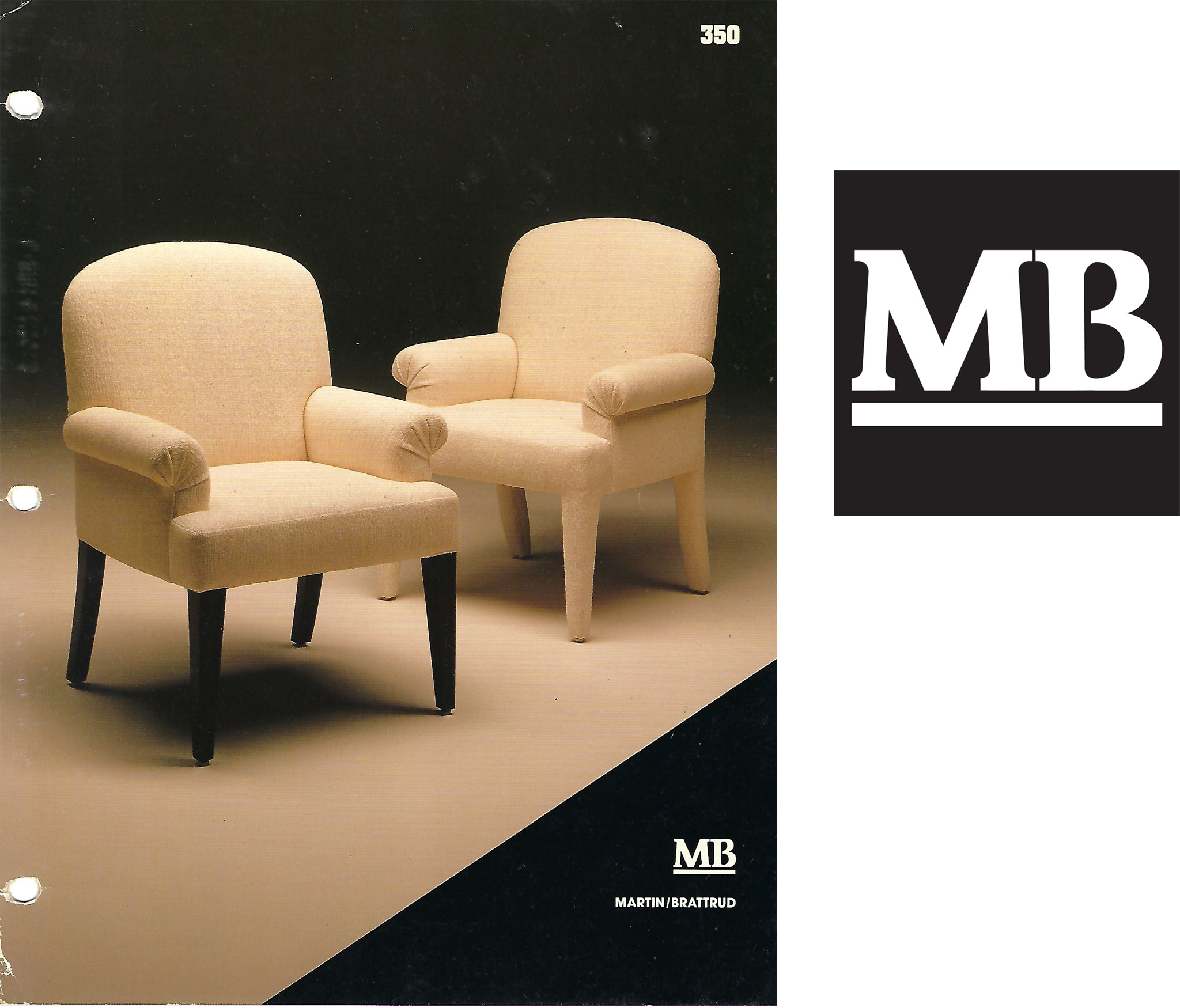
A monogram followed that would modernize the M and B. Locked together with the lance reduced to a dot, the flair of the original logo remained, but in a shorthand form that would appear on cut sheets and other printed materials throughout the 1980s.
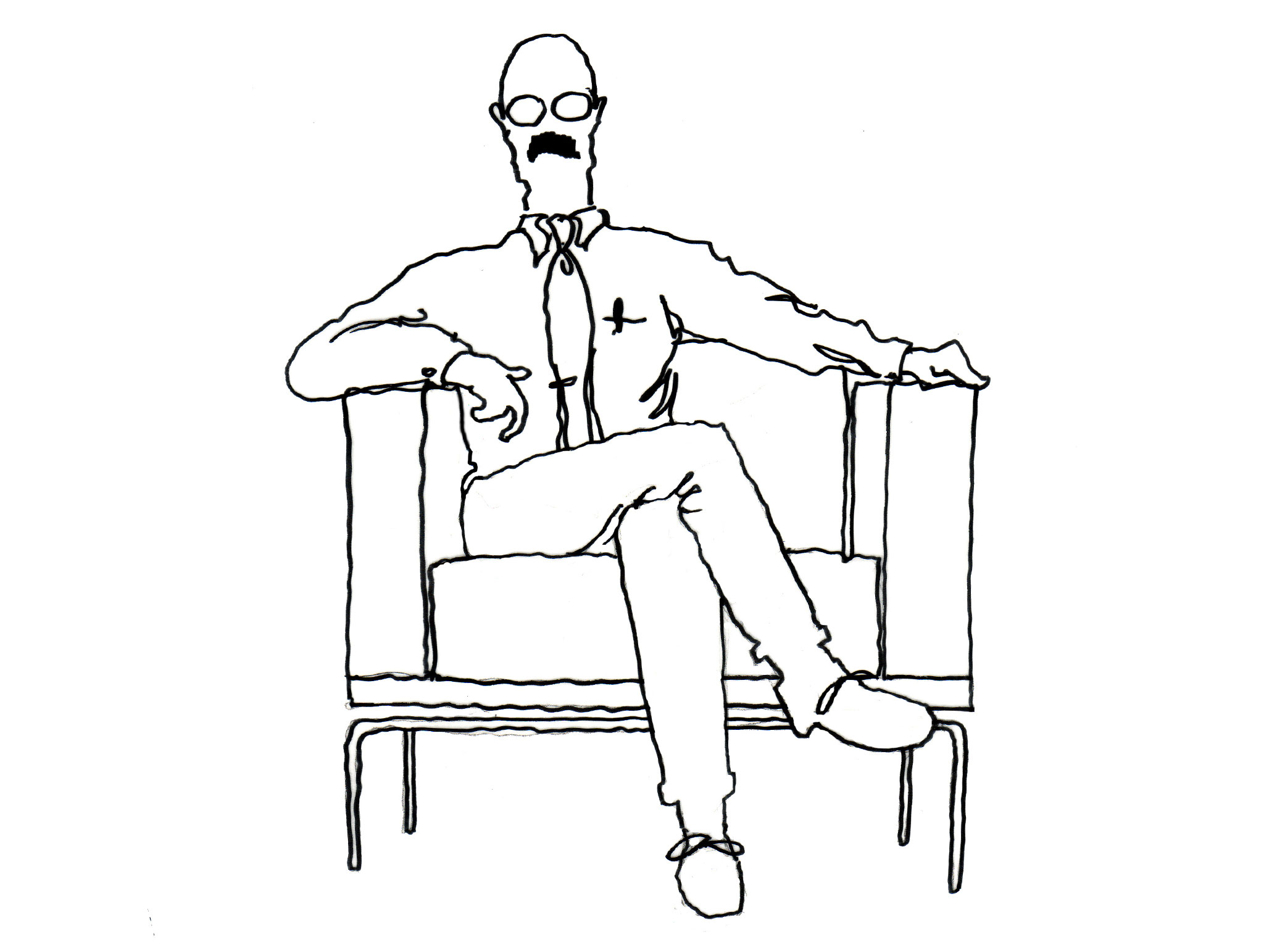
In the late 1980s we added the "MB Man" to our graphics arsenal. He would appear on tote bags, showroom walls, and other materials, adding a hand drawn sensibility and tieing into our handcrafted story. The "MB Man" would continue to be employed throughout our marketing visuals for many years.
By 1990 the monogram would leverage a chunky slab serif font, favoring legibility over the artistic expression of the original swooping M and B letterforms.
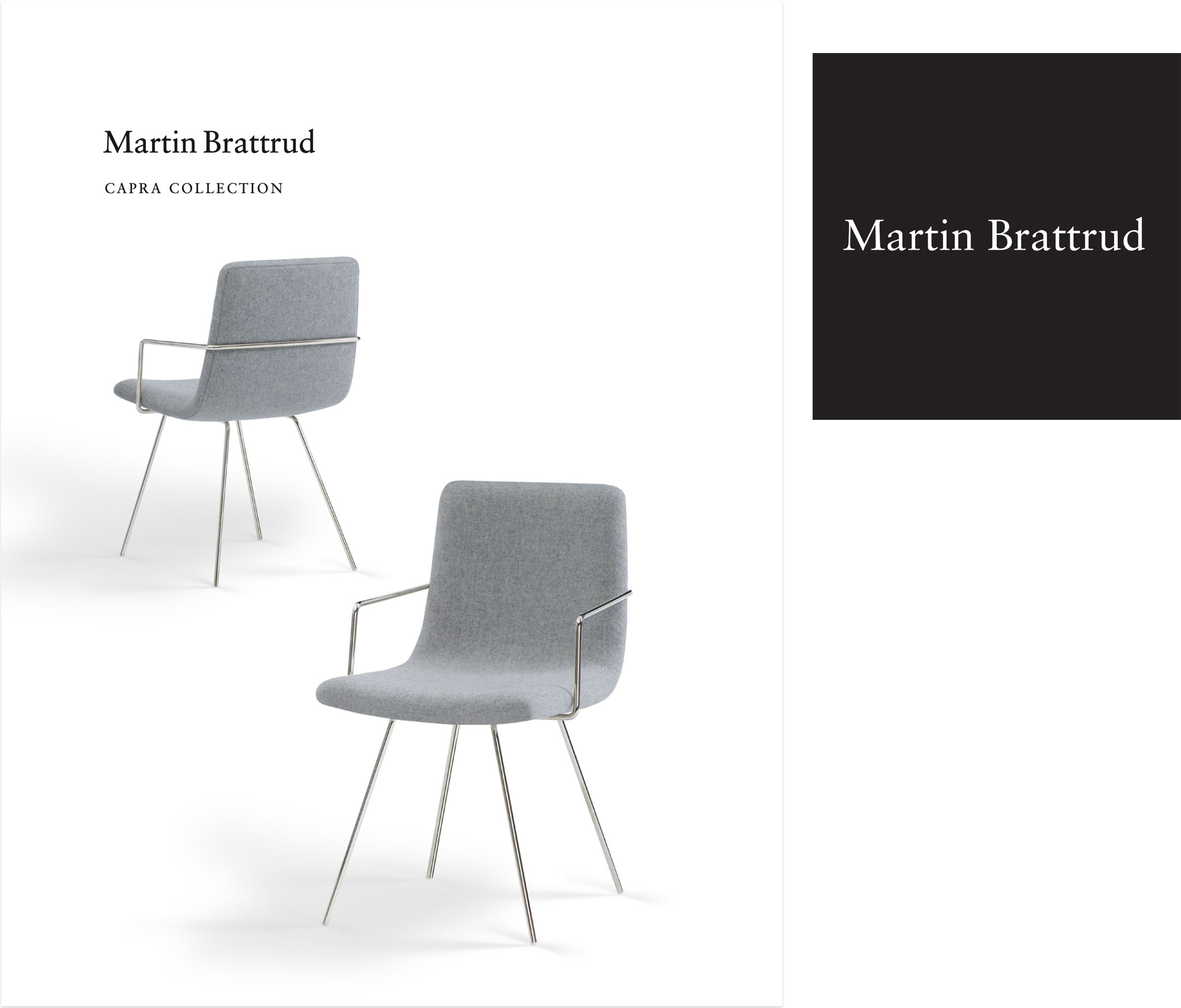
By the late 90s the company had transitioned from a regional residential manufacturer to national contract brand. With a need to convey elegance and sophistication, a new typeface was introduced—Sabon. This classic Old Style typeface is a descendent of Garamond and conveyed our upscale, no-nonsense character.
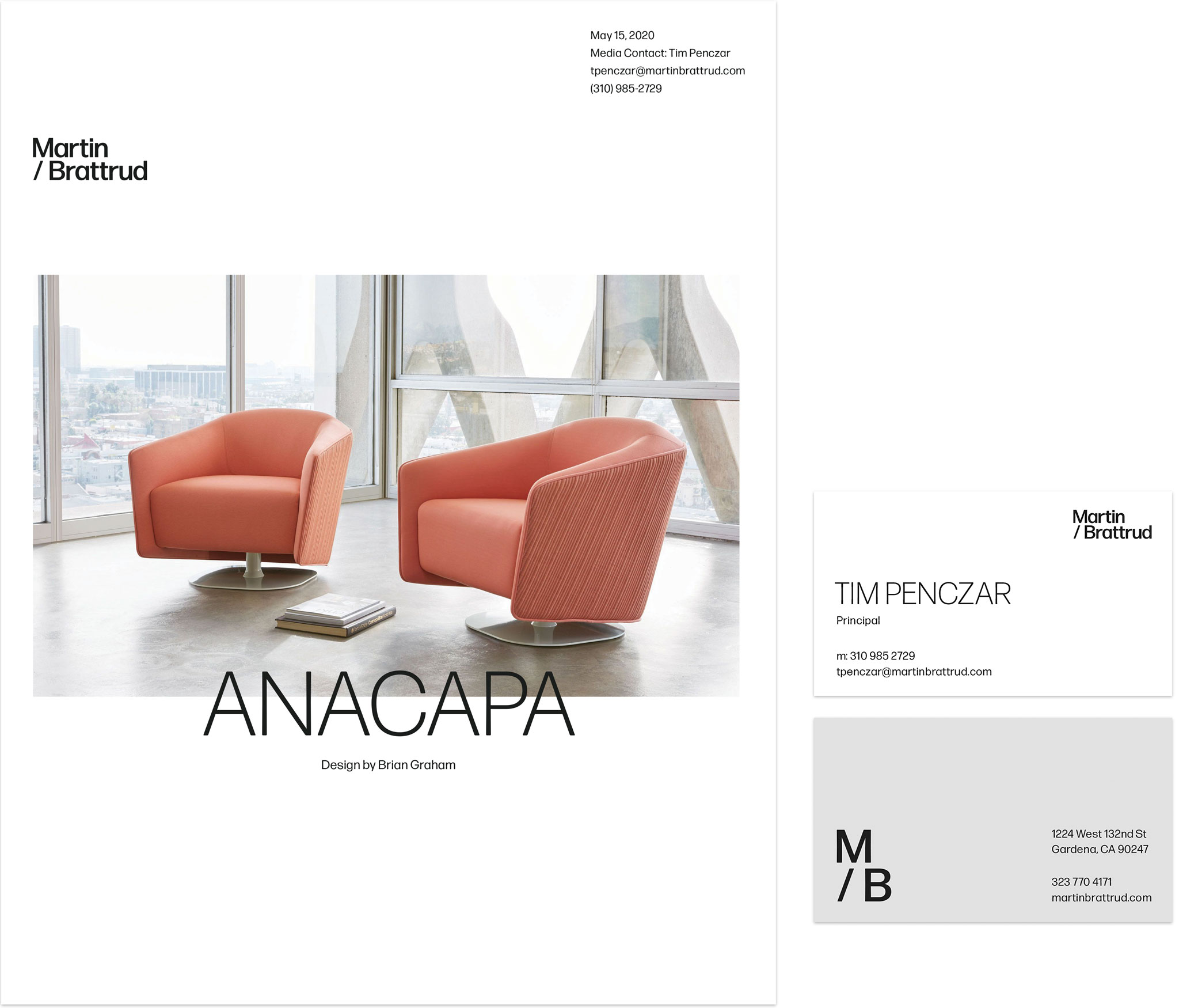
In 2020 we introduced a new identity. Pulling from the very first iteration of our logo but with contemporary objectives, the lance and strong diagonal are now forever locked into the logotype by aligning diagonals in the "M" and "/". Stacking the text on two lines provides a more workable shape and increases legibility for smaller placements and also allows for a direct monogram variant. Further referencing the original lance, we created stretched versions of the monogram for larger applications. Primary and secondary color palettes and new font selections round out the building blocks of the identity.
While the underlying DNA of our identity remains, some things have changed.
"Then" we were print.
"Now" we are digital.
"Then" we had limited touchpoints.
"Now" we have countless opportunities to engage our audience.
"Then" we were forming our identity.
"Now" we are building on the best parts of our heritage.
Stay tuned through the rest of the year as we'll continue to look back at moments in time, and how the "then" led us to the "now".
To learn more about our story, please visit our history page.